


- Example of pareto diagram
- When to use it?
- How to use it?
- What is pugh analysis?
What is pareto chart?
A Pareto diagram is a bar graph. The lengths of the each bar mean the frequency or cost (time or money) and are placed with longest bars on the left and the shortest to the right. In this way the chart visually shows which situations are more significant. The 80-20 theory was first developed in 1906, by Italian economist, Vilfredo Pareto, who observed an unequal distribution of wealth and power in a relatively small proportion of the total population. The business applications were adapted by Joseph M. Juran.

Why is it important?
Pareto chart is a tool for visualising the Pareto principle, which states that a small set of problems can affect much more a common outcome tend than the remaining items. A Pareto chart can be used to decide which subset of problems should be solved as first ones, or which problems need the most attention. Pareto charts are often constructed to provide a before-and-after comparison of the effect of control or quality improvement measures.
When to use it?
The Pareto Chart is used to demonstrate the occurrences of problems or defects in a descending order. It is used for making decisions at critical points in different processes, which means it can be used both during the development phase as well as when products are in serial use, e.g. customer complaints.
- When analyzing data about the frequency of problems or causes in a process.
- When there are many problems or causes and you want to focus on the most significant.
- When analyzing broad causes by looking at their specific components.
- When communicating with others about your data.
How to use it?
Step by step process to address an issue:
- List all elements of your interest.
- Measure the elements, for measurement use the same unit for each element.
- Order the elements according to measurement results.
- Calculate the percentage for each element out of the total measurement.
- Accumulate the percentage from top to bottom to equal 100%.
- Create a bar and line graph, line represents the cumulative percentage.
- Work on the most important element (or elements) first.
Pareto charts are a key improvement tool because they help us identify patterns and potential causes of a problem. One trick which is often overlooked is to create several Pareto charts out of the same set of data. More Pareto charts can help quickly scan a number of factors that might contribute to a problem and focus on those with the greatest potential risk.
Download our e-book
Download our free e-book to discover how GQ Interim can transform your business with expert leadership solutions!
What is pugh analysis?
Pugh Analysis is very similar to the pros vs. cons lists. These charts are used for evaluation of multiple options, factors, indicators against each other, in relation to a main baseline option. The Pugh matrix helps determine which items or potential solutions are more important or ‘better’ than others. The method was created by Stuart Pugh from Scotland as an approach for selection of concept alternatives.
Why is it important?
This chart is great for use due to time needed for creation. To create the chart takes a development team to analyze the scores and weighting factors is usually much shorter and cheaper compared to deploying the wrong solution to a project. The next step ranking the criteria further helps focus the team’s efforts on the critical few.
The Pugh matrix allows an individual or team to:
- Compare different concepts.
- Create strong alternative concepts from weaker concepts.
- Create an optimal concept that may be a combination or variant of the best of other concepts.
When to use it?
To list the positive and negative aspects of each option, one by one, to create a matrix of the needs vs. concepts helps address multiple factors at the same time and gives the team a holistic view of the needs vs. alternatives at hand.
How to use it?
Step by step process:
- Develop a set of criteria according to the customer’s requirements.
- Enhance these criteria by including any item of functional nature.
- Generate a group of design concepts which are meant to satisfy the criteria.
- Using a simple matrix – list criteria on the left and the concepts across the top. Use simple sketches to illustrate each of these concepts.
- Set one of the concepts as a baseline.
- Evaluate each concept against the datum for each of the criteria. Determine whether it is better (+), the same (0) or worse(-) than the baseline. Alternately, one could assign a -1, 0, +1 based on where each choice would stack up against a set of the agreed-to criteria. We could give each of these criterion a weight and get the composite score of the alternate criterion to determine the better alternative.
- Record the team’s decisions on the matrix.
- For each column, determine the total number of pluses, minuses and sames. Alternately, take the sum of the alternate score multiplied by weight of the criterion.
- Work to improve those concepts that scored best by incorporating strong ideas from other concepts.
- Continue the process of synthesizing concepts.
Conclusion
The Pareto chart in quality control is more than just a bar graph—it’s a strategic tool that empowers organizations to tackle the most critical issues with clarity and purpose. By separating the “vital few” from the “trivial many,” teams can allocate time, resources, and attention where they will have the greatest impact.
Whether used to analyze defects, reduce downtime, or improve customer satisfaction, the Pareto chart drives data-informed decisions that lead to measurable results. When embedded into regular quality control practices, it supports a culture of continuous improvement and proactive problem-solving that enhances both operational efficiency and long-term business performance.
Interested in Interim Expert?
Discover how interim management can dramatically increase the efficiency of your business. Get in touch with our team to learn how working with GQ Interim will improve your company.
- Get started within few days
- Database of 10 000+ consultants
- Solving crucial problems of your business
- Custom solutions for your business needs
- Proven results with measurable impact
Related articles
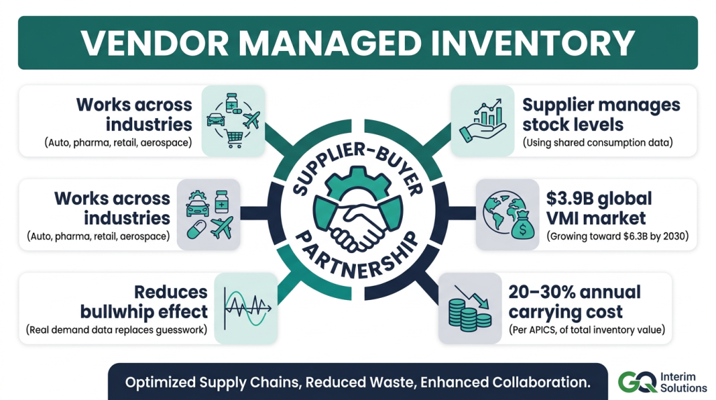
- Wondering if Vendor Management Inventory is right for your plant or network? This guide unpacks how VMI works, where it delivers savings and stability, the pitfalls to avoid, and the KPIs and tech you need to stay in control.

- Managing every supplier the same way rarely delivers the best results. Supplier segmentation helps businesses prioritize supplier relationships, reduce risk, and focus procurement efforts where they create the greatest value.

- Hiring a senior sales leader is one of the most important decisions a growing business can make. Learn how sales executive search works, when it's the right choice, and why it consistently delivers stronger long-term hiring outcomes than traditional recruitment.

- Great products don't happen by accident. Behind every successful product is strong leadership that aligns business strategy, customer needs, and cross-functional teams. Discover what product leadership involves, why it matters, and how it helps businesses make better product decisions.
